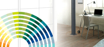
Colour is more than just a shade – it’s an identity, a statement and a reflection of your own personal tastes. Colour in your home provides personality and uniqueness, ensuring no two homes look quite alike. Whatever your preference, whether it’s bold and bright or mute and neutral, the colour you use in your home transforms its appearance.
The vital importance of colour explains why repainting or wallpapering a home can create such an instant aesthetic impact, as it instantly alters the overall look and feel of the property. With relatively little effort, colour helps you completely change your home and its overall personality. Here are our top tips for putting colour to use.
It’s about shades
Think of colours and you’ll immediately think of the ones you like – but you’ll also likely default to primary shades such as red, blue, green etc. For home designers, these base-level colours are not enough, and shades are brought into a home to create subtlety and style. Instead of blue, it’s better to diversify your thinking into shades such as aqua, sky, navy etc. These help create a deeper, more nuanced sense of style – and also allow you to experiment with mood.
Using blue as an example, navy is a far bolder and more confident shade than the relaxing, dreamy shade of sky blue – which means you choose to use sky in a child’s bedroom and leave Navy for an office.
Scheme is vital
Choosing your shades won’t work unless you tie them together with an overall theme. For example, contrasting colours work – but clashing them together does not. Black wallpaper with grey carpets would provide pleasing contrast, whereas yellow walls with red flooring would be very difficult to pull off in anywhere but the zaniest household. To keep things simple, here are a number of accepted ‘themes’ designers use:
- Tonal schemes – Using varying tones of one colour creates a beautiful tonal look. For example, using turquoise, sky blue and very light blue cushions broken only by a wooden floor and white furniture.
- Harmonious schemes – Harmonious schemes use colours that are close to one another on the colour wheel – such as pink and purple.
- Contrasting schemes – Contrasting schemes are bold and noticeable, so it’s important to create contrasts that work. This will come down to practice and personal taste.
- Monochrome schemes – Monochrome such as black and grey creates a modern look that can withstand the test of time.
Textures
To complement colour, you need to consider the natural textures that will be a part of your home. That full glass wardrobe? You’ll need a colour that works with it. Wooden floor? Your colour choice will be affected. Choose to carefully blend colour with the natural textures of furniture and you’ll create a winning combination that truly looks amazing.
At The Sliding Door Wardrobe Company, we offer wardrobes that come in a range of materials that can be selected to match up with your brand new colour scheme. From classic wood to mirror and other finishes, check out our sliding door wardrobes to learn more.


