What is minimalism?
Minimalism is currently a very trendy design style which focuses on simplicity and sleek, modern design. If you’re looking for minimalist bedroom design ideas or bold home design choices, read on for our tips on creating a minimalist interior for your home using colour.
Colour in your walls and doors
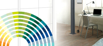
When creating a bold and minimalist look, it’s essential not to overdo colour. Walls should generally be a clean and uniform colour, however try to avoid pastel tones as these are more traditional colours. Often a clean ivory is best for these wall colours, and will work well in providing contrast with bolder elements of the room later on. The doors should be a contrasting colour to the walls to provide an intuitive interior layout – red, dark grey or dark green all work well here to provide a confident and stylish layout to your home. It’s important to differentiate between key interactable design elements, such as doors, and passive elements of the interior design, such as walls. These interactable design elements should be highlighted in the environment with bold colours, whilst other elements should use more muted colours. Minimalistic design does not add unnecessary decoration and focuses on clear layout by removing distraction from a few stand-out pieces – so leave plenty of breathing room for the parts of your design which you want to stand out.
Materials and textures to use in interior design
It’s important in minimalist design to use specific materials and textures to create the desired look. Glass is a classic material in minimalist design, with metals such as stainless steel also being popular for its qualities. Wood can also be used, however it should not be a predominant material within the room. This is largely because of the texture and irregularity of wood, which goes against minimalist design principles. Generally, minimalist materials should be uniform in colour and texture, however the natural grain of wood makes it a more organic material; the details and imperfections present in wood conflict with minimalist ideas. As a general rule, any textures used in a minimalist home should be uniform and used sparingly.
Colour in furniture and objects
When choosing furniture and objects in the room, stick to the muted ivory colours of your walls for the majority of your furniture. For stand-out pieces, especially interactable objects such as telephones and TV remotes, choose a single highlight option such as red to use sparingly throughout the room. This will draw the eye to particular areas of the room and create a space which is easily understandable and simple to interact with. You can also use this colour within larger objects, such as wardrobes. With our interactive wardrobe maker, you can choose specific colours and materials for different areas of your wardrobe to highlight parts of particular significance. This could be the part of your wardrobe containing your most special outfits, or the drawer where you keep your cosmetic products. Our Sliding Door Wardrobes are perfect Again, remember that less is more; only choose a few specific places around the room to highlight in this colour, and keep the rest of the room in your primary muted colour to provide contrast.
Now that you’ve got some ideas on creating a minimalist interior design, start designing and choosing furniture! For more information on our minimalist sliding door wardrobes, call us today on 0191 487 5870 to speak to us about our options.


